How I redesigned UNTUCKit's website to drive record-breaking holiday sales up by 32%. (Part 1)
*This case study primarily focuses on redesigning of the top navigation and product listing page experience due to the same release phase.
How I redesigned UNTUCKit's website to drive record-breaking holiday sales up by 32%. (Part 1)
*This case study primarily focuses on redesigning of the top navigation and product listing page experience due to the same release phase.
How I redesigned UNTUCKit's website to drive record-breaking holiday sales up by 32%. (Part 1)
*This case study primarily focuses on redesigning of the top navigation and product listing page experience due to the same release phase.
How I redesigned UNTUCKit's website to drive record-breaking holiday sales up by 32%. (Part 1)
*This case study primarily focuses on redesigning of the top navigation and product listing page experience due to the same release phase.
Project Overview
Quick Facts
01
Client Background
UNTUCKit is an apparel startup renowned for its stylish and comfortable casual shirts designed to be worn untucked, which has achieved significant market success since founded in 2011.
02
Project Goals
To enhance usability, develop a more intuitive user experience, and achieve a modern aesthetic for the website, which has become outdated since its original creation in 2018.
03
Time Frame
9 Months, Launched in Q3 2022
04
Challenges
Along with persuading senior leaders of the value of user research and making it a standard practice, we also faced the challenge of integrating too many third-party vendors.
Project Overview
01
Client Background
UNTUCKit is an apparel startup renowned for its stylish and comfortable casual shirts designed to be worn untucked, which has achieved significant market success since founded in 2011.
02
Project Goals
To enhance usability, develop a more intuitive user experience, and achieve a modern aesthetic for the website, which has become outdated since its original creation in 2018.
03
Time Frame
9 Months, Launched in Q3 2022
04
Challenges
Along with persuading senior leaders of the value of user research and making it a standard practice, we also faced the challenge of integrating too many third-party vendors.
My Role
Quick Facts
01
Leadership
I led a 10-person cross-functional team, establishing streamlined development processes and fostering effective communication to deliver a superior user experience.
02
Research & User Testing
I conducted a website audit based on Baymard's 214 UX usability guidelines, collaborated with a data analyst to identify improvement opportunities, and carried out user testing with 12 participants to gather feedback.
03
Strategy & Ideation
I led the collaborative effort to define the project scopes and requirements, and prioritized key features. I encouraged innovative and strategic thinking through engaging discussions and ideation sessions.
04
Design & Prototype
I created wireframes, refined UI designs, and developed prototypes for user testings.
My Role
01
Leadership
I led a 10-person cross-functional team, establishing streamlined development processes and fostering effective communication to deliver a superior user experience.
02
Research & User Testing
I conducted a website audit based on Baymard's 214 UX usability guidelines, collaborated with a data analyst to identify improvement opportunities, and carried out user testing with 12 participants to gather feedback.
03
Strategy & Ideation
I led the collaborative effort to define the project scopes and requirements, and prioritized key features. I encouraged innovative and strategic thinking through engaging discussions and ideation sessions.
04
Design & Prototype
I created wireframes, refined UI designs, and developed prototypes for user testings.
Record-Breaking Performance
2022 vs 2021
Black Friday / Cyber Monday Campaigns
%
Online Sales Increase YoY
%
Core Business Increase YoY
Following the redesign of the top navigation and product listing page (PLP) in September 2022, we successfully attained the highest sales performance during the fourth quarter holiday season compared to the previous year.
%
Conversion Rate
Total Site Q4, 2022
Performance
%
Revenue YoY
Record-Breaking Performance
2022 vs 2021
Black Friday / Cyber Monday Campaigns
%
Online Sales Increase YoY
%
Core Business Increase YoY
Following the redesign of the top navigation and product listing page (PLP) in September 2022, we successfully attained the highest sales performance during the fourth quarter holiday season compared to the previous year.
%
Conversion Rate
Total Site Q4 Performance
%
Revenue YoY
Research
Research
Research
Research
When I started in 2021, I observed a lack of user research and no actionable plans for translating collected data. I gradually introduced various research methods to senior leadership, highlighting the value of user research, and integrated it into our regular practices.
When I started in 2021, I observed a lack of user research and no actionable plans for translating collected data. I gradually introduced various research methods to senior leadership, highlighting the value of user research, and integrated it into our regular practices.
When I started in 2021, I observed a lack of user research and no actionable plans for translating collected data. I gradually introduced various research methods to senior leadership, highlighting the value of user research, and integrated it into our regular practices.
When I started in 2021, I observed a lack of user research and no actionable plans for translating collected data. I gradually introduced various research methods to senior leadership, highlighting the value of user research, and integrated it into our regular practices.
Quantitative Insights
Step 1: Unlocking the Power of Numbers
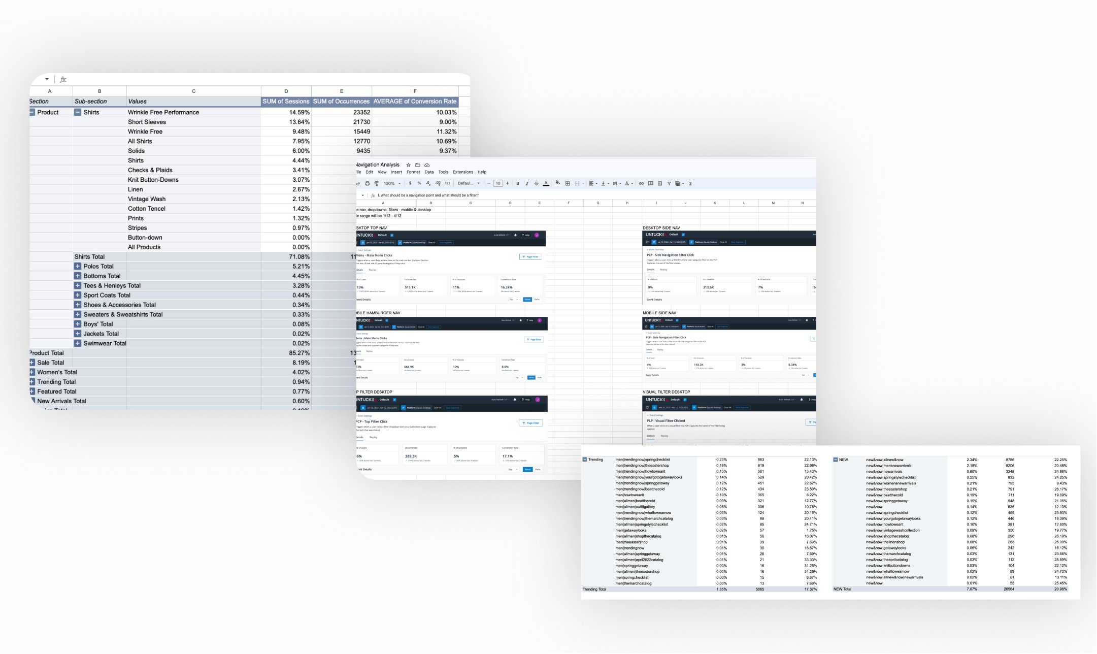
I collaborated with data analysts to optimize user journeys, improve satisfaction, and inform design decisions. We reviewed metrics including click-through, conversion, sessions, and abandoned rate. This data convinced senior leaders to embrace changes.
Quantitative Insights
Step 1: Unlocking the Power of Numbers
I collaborated with data analysts to optimize user journeys, improve satisfaction, and inform design decisions. We reviewed metrics including click-through, conversion, sessions, and abandoned rate. This data convinced senior leaders to embrace changes.
Qualitative Insights
Step 2: Leveraging Baymard to Uncover Usability Issues and Customers Frustrations
I introduced Baymard's comprehensive research guidelines for a preliminary website audit, revealing prevalent user frustrations. Utilizing Baymard's expertise in UX enhancements and industry benchmarking, senior leadership was notably impressed, paving the way for swift approval of moderated user testing in the subsequent project phase. We mainly focus on the dropdown nav experience for this case study. While we have conducted an audit of the courtesy navigation (account, store locator, wishlist) and search functionality, we wanted to prioritize the scope that makes the biggest impact with limited resources.
(1) Pre-Design Top Navigation Menu
Paint Points
Paint Points
Paint Points
Overlapping and redundant categories cause overwhelming options on dropdown navigation
Unclear hierarchy and non-clickable sub-category links
The text is difficult to identify as either a hyperlink or plain text.
Some sub-category links should be used as filters
Inconsistent naming for category links and PLP Header
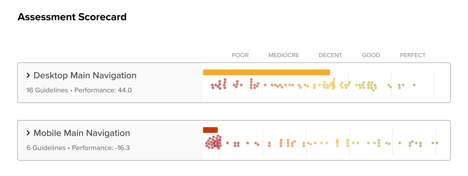
*Note: Based on Baymard, the navigation menu is ranked on the lower end of “Decent” & “Poor” for mobile experience.
*Note: Based on Baymard, the navigation menu is ranked on the lower end of “Decent” & “Poor” for mobile experience.
*Note: Based on Baymard, the navigation menu is ranked on the lower end of “Decent” & “Poor” for mobile experience.
*Note: Based on Baymard, the navigation menu is ranked on the lower end of “Decent” & “Poor” for mobile experience.
(2) Pre-Design Search
Paint Points
Paint Points
Paint Points
Occurrence of irrelevant return results
Missing capability to perform certain search query types for keywords, such as “thematic”, “product feature attributes”, “subjective”
Different search result page templates from regular product listing page
Missing displaying search field
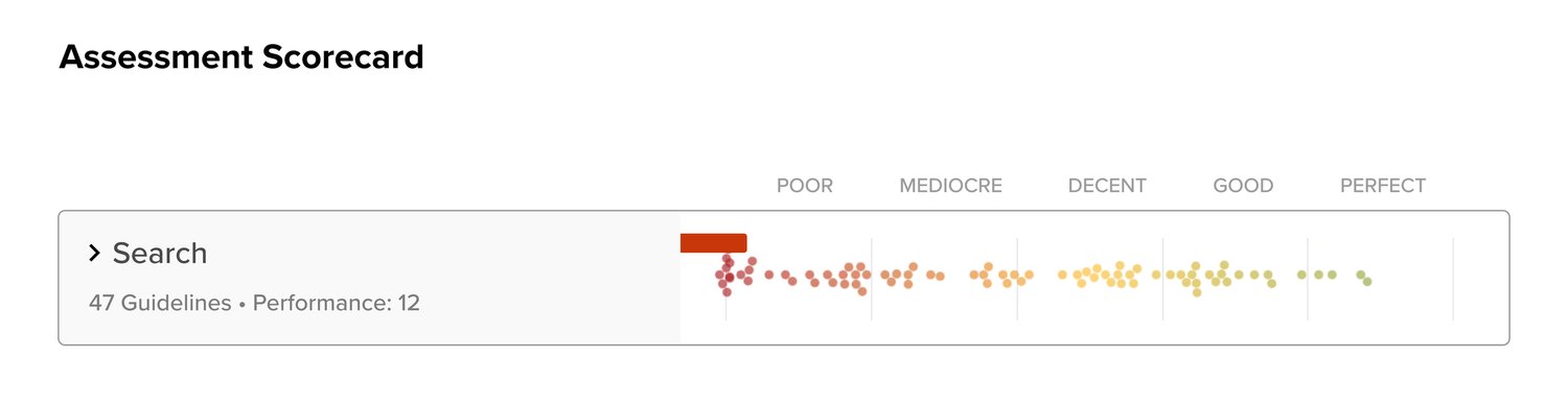
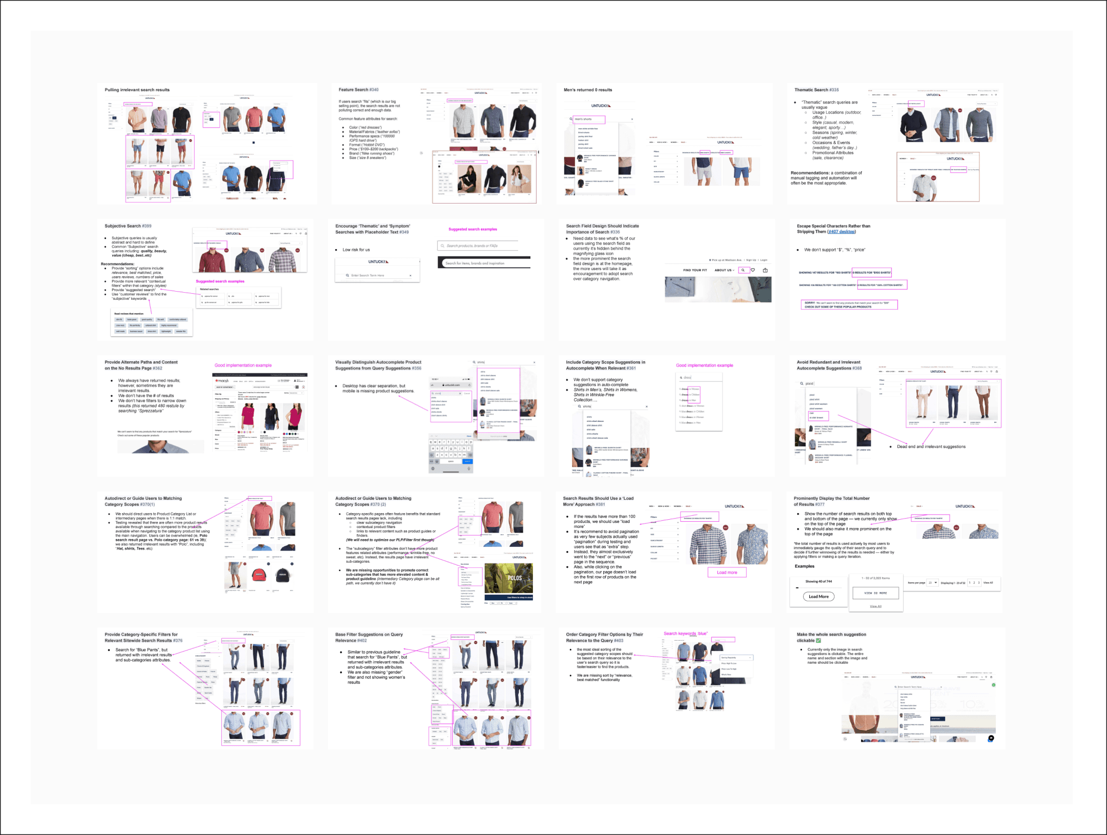
*Note: As we work on organizing and improving the backend tagging, we plan to reassess our current third-party search engine provider in the future, considering our resource limitations.
*Note: As we work on organizing and improving the backend tagging, we plan to reassess our current third-party search engine provider in the future, considering our resource limitations.
*Note: As we work on organizing and improving the backend tagging, we plan to reassess our current third-party search engine provider in the future, considering our resource limitations.
*Note: As we work on organizing and improving the backend tagging, we plan to reassess our current third-party search engine provider in the future, considering our resource limitations.
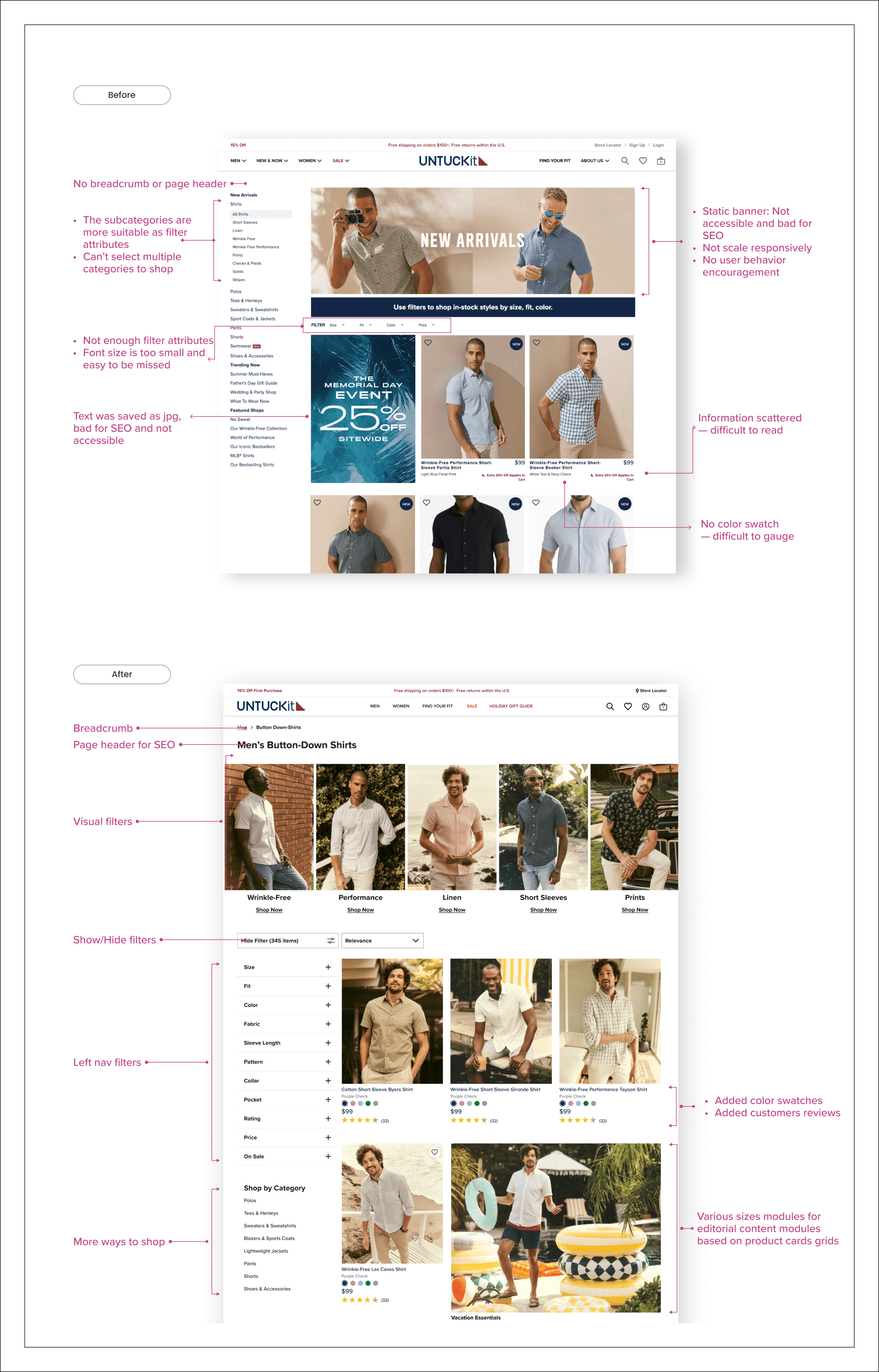
(3) Pre-Design Product Listing Page
Paint Points
Paint Points
Paint Points
Lack of "Sort By" functionality to facilitate faster sorting of relevant results
Improve filter attributes logic:
Sub-categories should be used as filter attributes
Allow users to select multiple filters and narrow down results quickly
Missing category-specific filters
Note: Due to Shopify limitations, products with the same style but different colors are listed separately, leading to increased scrolling and user confusion.
Note: Due to Shopify limitations, products with the same style but different colors are listed separately, leading to increased scrolling and user confusion.
Note: Due to Shopify limitations, products with the same style but different colors are listed separately, leading to increased scrolling and user confusion.
Note: Due to Shopify limitations, products with the same style but different colors are listed separately, leading to increased scrolling and user confusion.
Design
Design
Design
Design
In redesigning the website for optimal user experience, I incorporated the Baymard research insights and metrics, focusing on intuitive navigation, clear visual cues, and a streamlined layout. The responsive design ensures seamless functionality across all devices, while improved accessibility features cater to users with disabilities, creating an inclusive and engaging online presence.
In redesigning the website for optimal user experience, I incorporated the Baymard research insights and metrics, focusing on intuitive navigation, clear visual cues, and a streamlined layout. The responsive design ensures seamless functionality across all devices, while improved accessibility features cater to users with disabilities, creating an inclusive and engaging online presence.
In redesigning the website for optimal user experience, I incorporated the Baymard research insights and metrics, focusing on intuitive navigation, clear visual cues, and a streamlined layout. The responsive design ensures seamless functionality across all devices, while improved accessibility features cater to users with disabilities, creating an inclusive and engaging online presence.
In redesigning the website for optimal user experience, I incorporated the Baymard research insights and metrics, focusing on intuitive navigation, clear visual cues, and a streamlined layout. The responsive design ensures seamless functionality across all devices, while improved accessibility features cater to users with disabilities, creating an inclusive and engaging online presence.
Site Map
Reconstructed Site Map to Support UNTUCKit's Lifestyle Brand Evolution
We crafted a site map to enhance information architecture, yielding a more organized structure. UNTUCKit, focusing on men's shirts, aspires to evolve into a diverse lifestyle brand. Equally prioritizing various categories aligns with this vision.
Top Navigation
Reduce the Clutter
I consolidated similar categories, removed redundant links, and used clear labels to create a clean, intuitive interface. This minimalist approach improved navigation findability and reduced cognitive overload, resulting in a more efficient shopping experience.
Top Navigation
Reduce the Clutter
I consolidated similar categories, removed redundant links, and used clear labels to create a clean, intuitive interface. This minimalist approach improved navigation findability and reduced cognitive overload, resulting in a more efficient shopping experience.
Top Navigation
Reduce the Clutter
I consolidated similar categories, removed redundant links, and used clear labels to create a clean, intuitive interface. This minimalist approach improved navigation findability and reduced cognitive overload, resulting in a more efficient shopping experience.
Top Navigation
Reduce the Clutter
I consolidated similar categories, removed redundant links, and used clear labels to create a clean, intuitive interface. This minimalist approach improved navigation findability and reduced cognitive overload, resulting in a more efficient shopping experience.
(1) Navigation Menu Design / Desktop
Design Process
We structured categories with a clear hierarchy for easy navigation and emphasized visual content for campaign highlights. Up to three campaigns can rotate, especially beneficial during busy holiday seasons with multiple promotions.
(1) Navigation Menu Design / Desktop
Design Process
We structured categories with a clear hierarchy for easy navigation and emphasized visual content for campaign highlights. Up to three campaigns can rotate, especially beneficial during busy holiday seasons with multiple promotions.
(1) Navigation Menu Design / Desktop
Design Process
We structured categories with a clear hierarchy for easy navigation and emphasized visual content for campaign highlights. Up to three campaigns can rotate, especially beneficial during busy holiday seasons with multiple promotions.
(1) Navigation Menu Design / Desktop
Design Process
We structured categories with a clear hierarchy for easy navigation and emphasized visual content for campaign highlights. Up to three campaigns can rotate, especially beneficial during busy holiday seasons with multiple promotions.
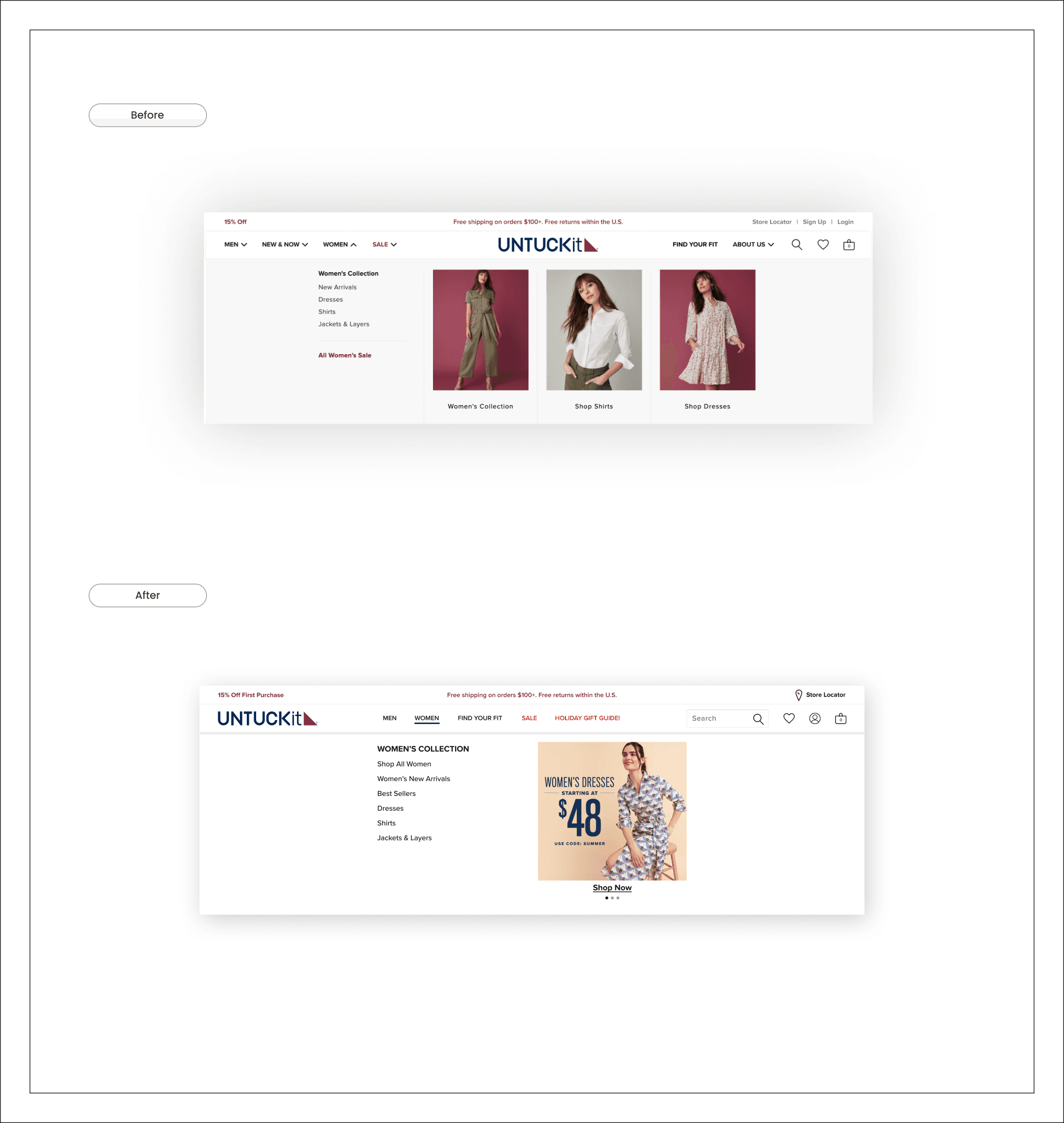
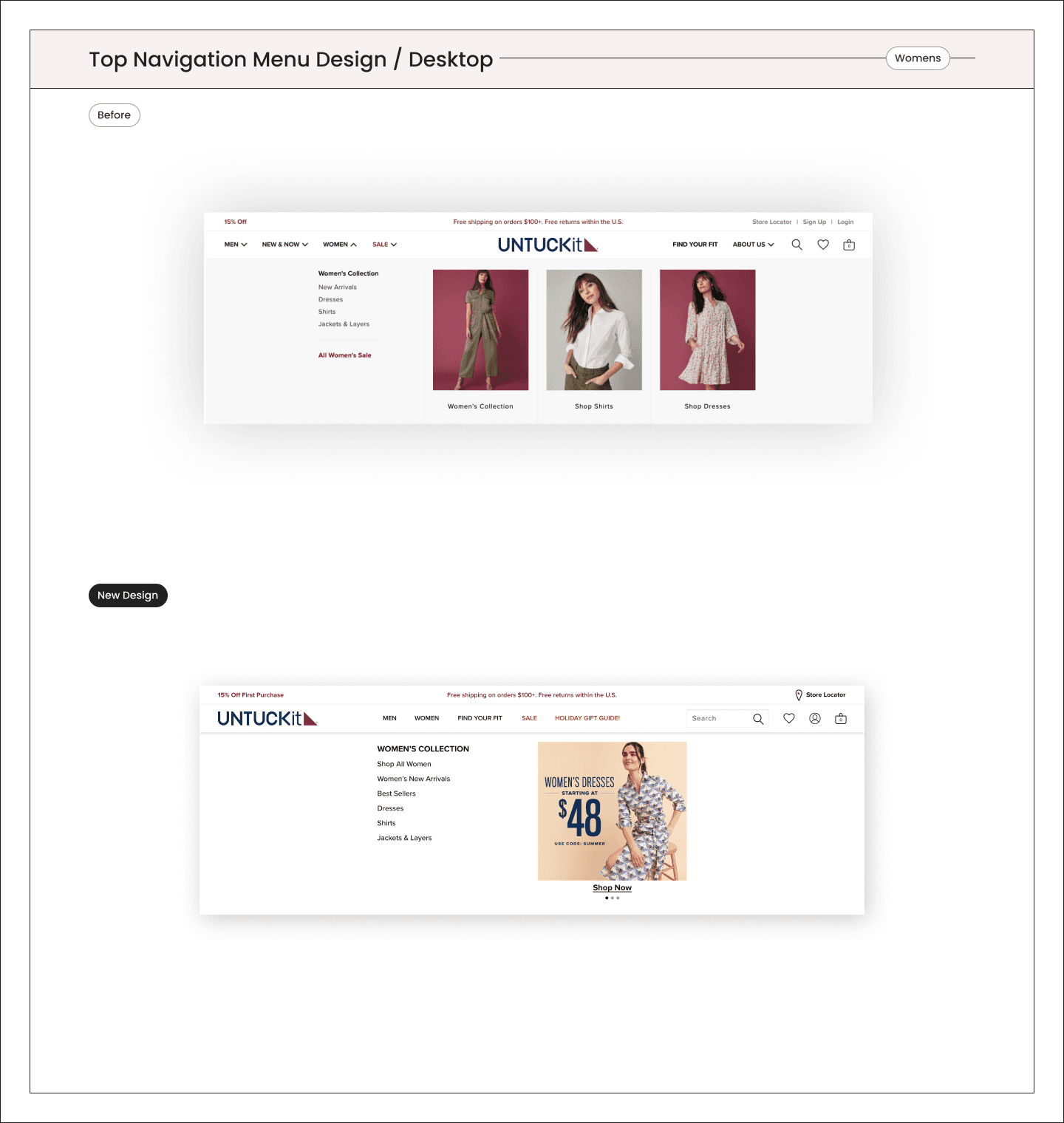
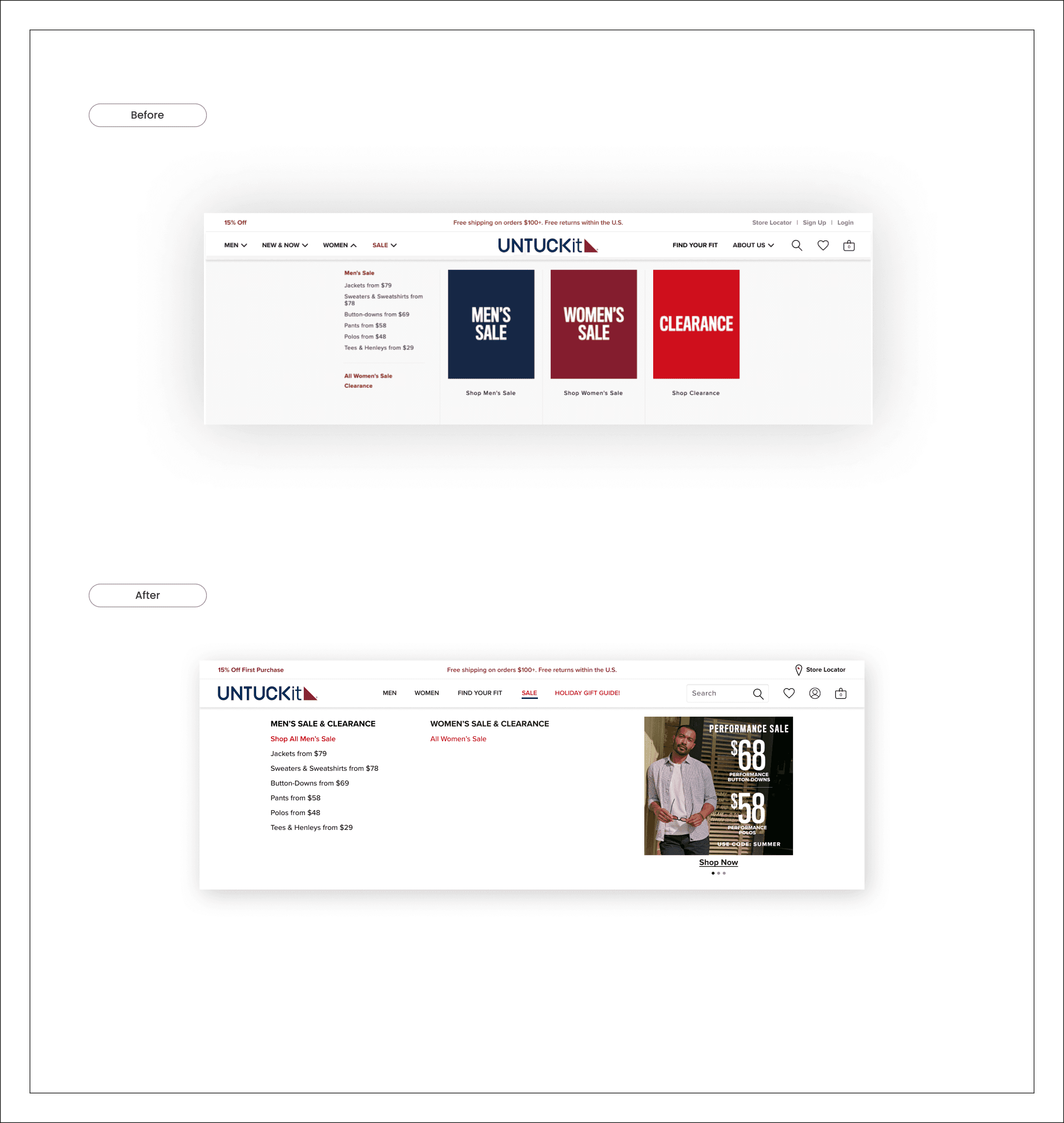
New Design/Live Site Example

New Design/Live Site Example
New Design/Live Site Example
New Design/Live Site Example
(2) Navigation Menu Design / Mobile
Design Process
The old design was cluttered and lacked consistent structure. In the new design, I applied Hick's law to simplify options and guide users efficiently by prioritizing simplicity and efficiency.
(2) Navigation Menu Design / Mobile
Design Process
The old design was cluttered and lacked consistent structure. In the new design, I applied Hick's law to simplify options and guide users efficiently by prioritizing simplicity and efficiency.
(2) Navigation Menu Design / Mobile
Design Process
The old design was cluttered and lacked consistent structure. In the new design, I applied Hick's law to simplify options and guide users efficiently by prioritizing simplicity and efficiency.
(2) Navigation Menu Design / Mobile
Design Process
The old design was cluttered and lacked consistent structure. In the new design, I applied Hick's law to simplify options and guide users efficiently by prioritizing simplicity and efficiency.
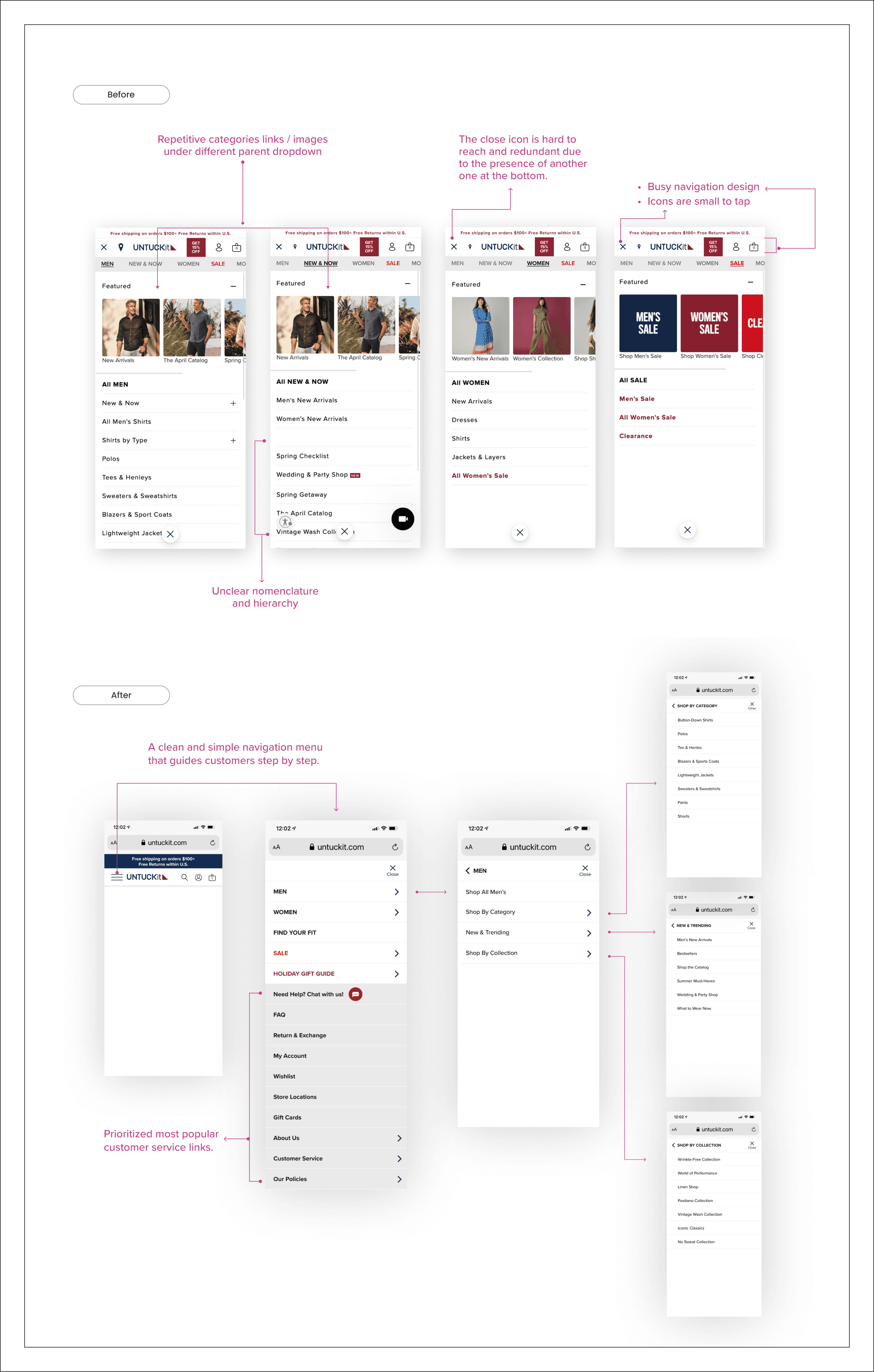

New Design/Live Site Example
Product Listing Page
Enhancing User Engagement
We've optimized user engagement with a dynamic visual filter, intuitive left nav filters, and a versatile "sort by" feature. This redesign allows tailored product discovery, complemented by larger, more engaging editorial cards for enriched content presentation.
Product Listing Page Design / Destkop
Default State
Product Listing Page Design / Destkop
Default State
Product Listing Page Design / Destkop
Default State
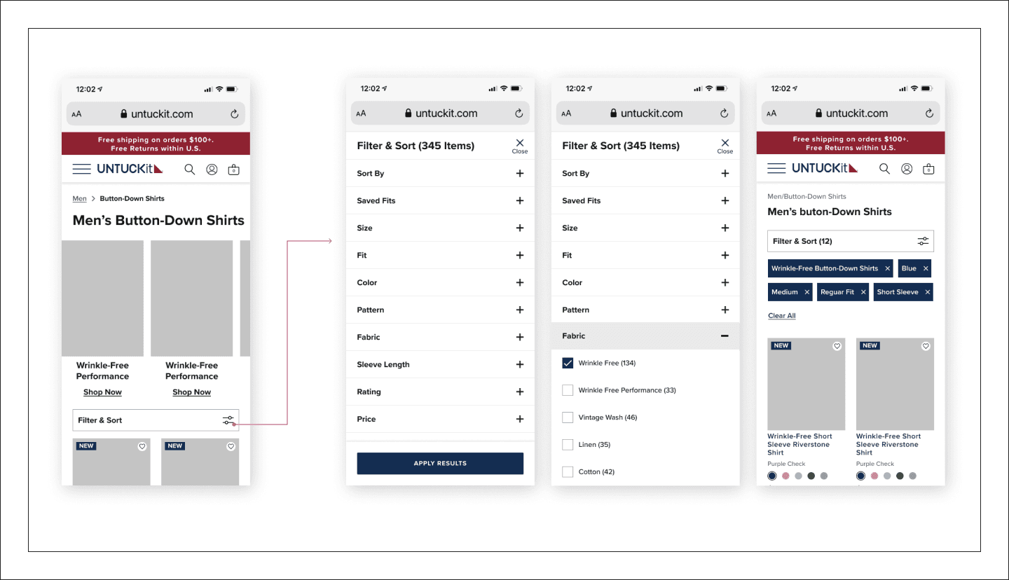
Product Listing Page Design / Mobile
Default State
Product Listing Page Design / Mobile
Default State
Product Listing Page Design / Mobile
Default State
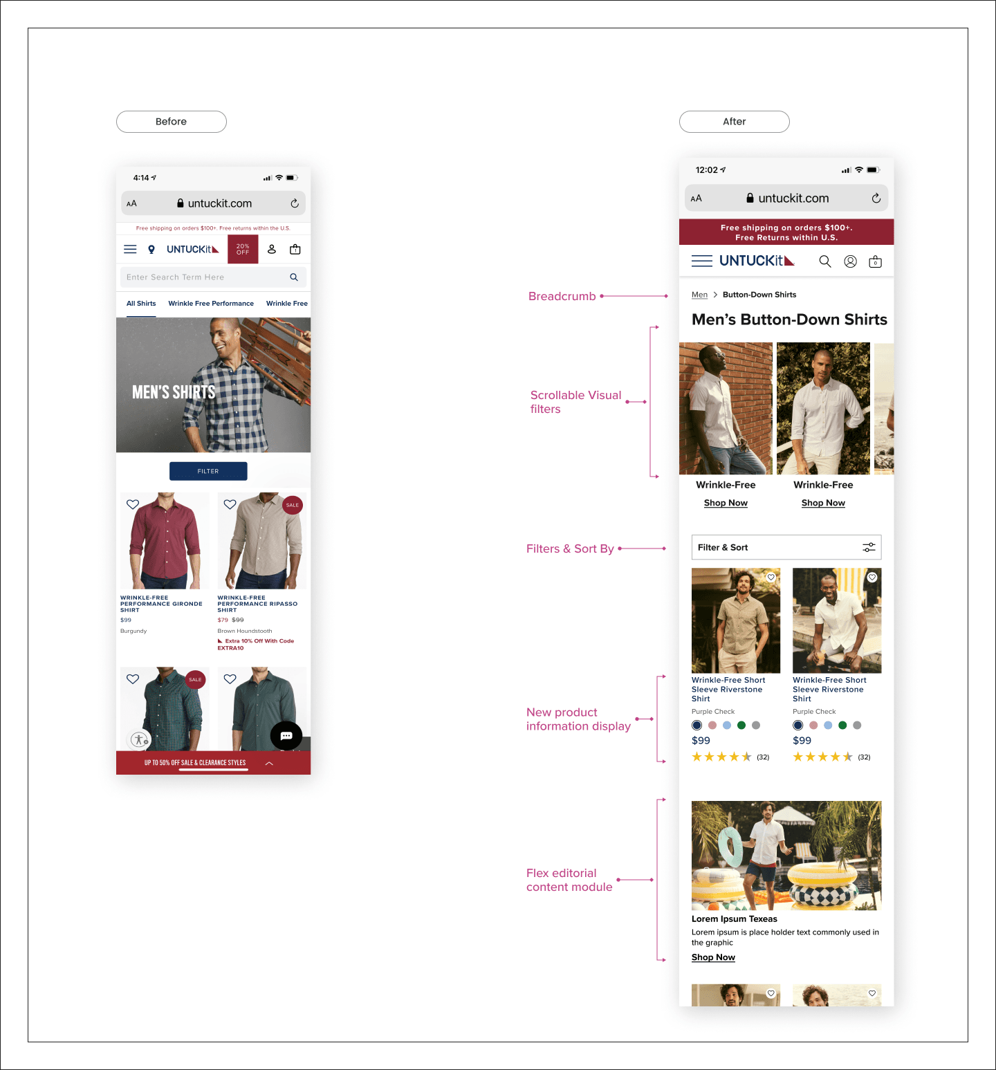
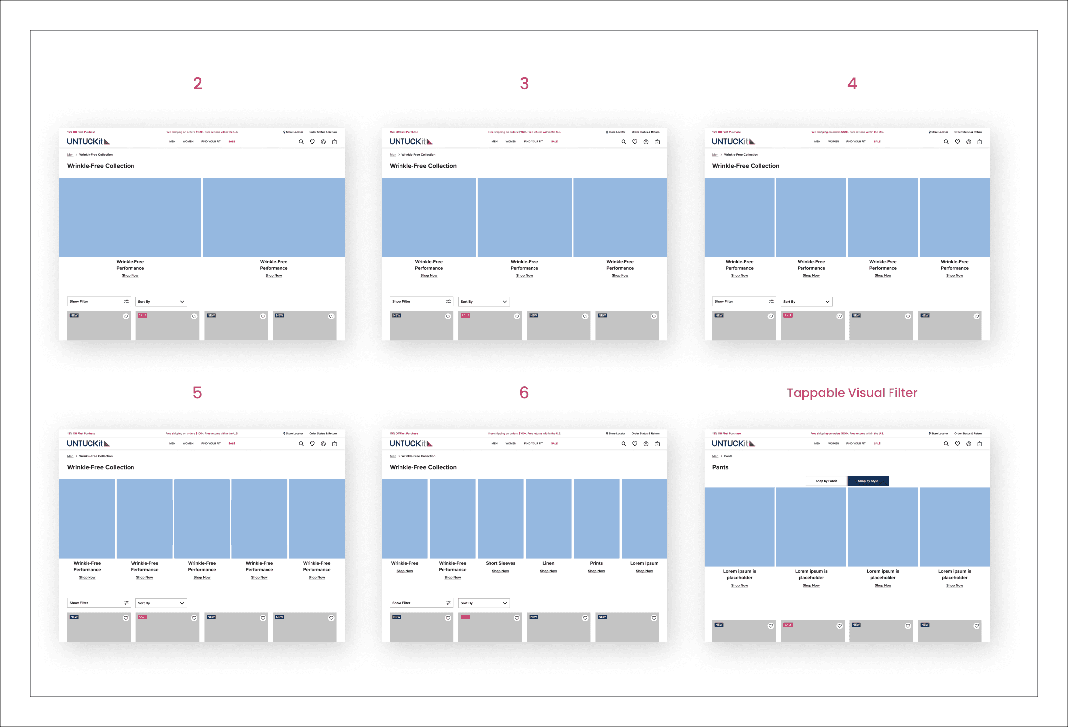
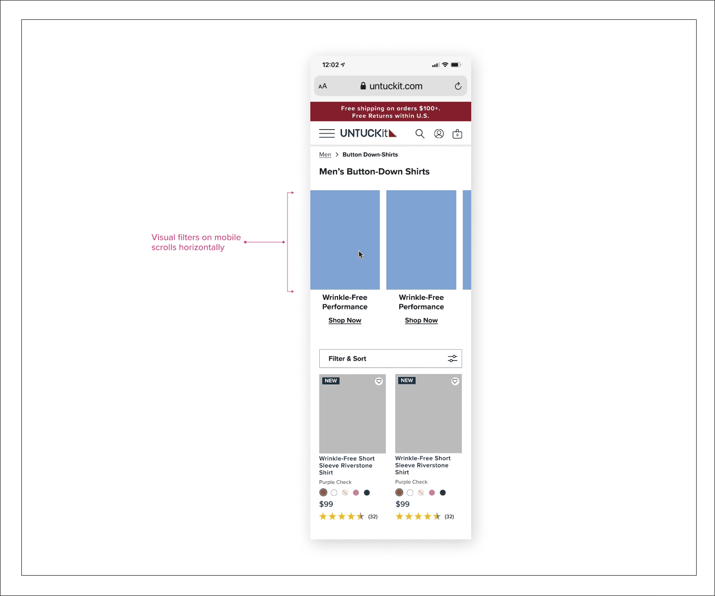
(1) Visual Filter Design
New Functionality
We replaced a static, unresponsive image banner with a dynamic visual guidance system that encourages immediate user engagement and efficiently filters sub-categories. This visual filter can be configured to range from 2 to 6 categories, depending on the strategies employed. Additionally, I implemented tabbed filters to allow customers to shop by the most-clicked attributes.
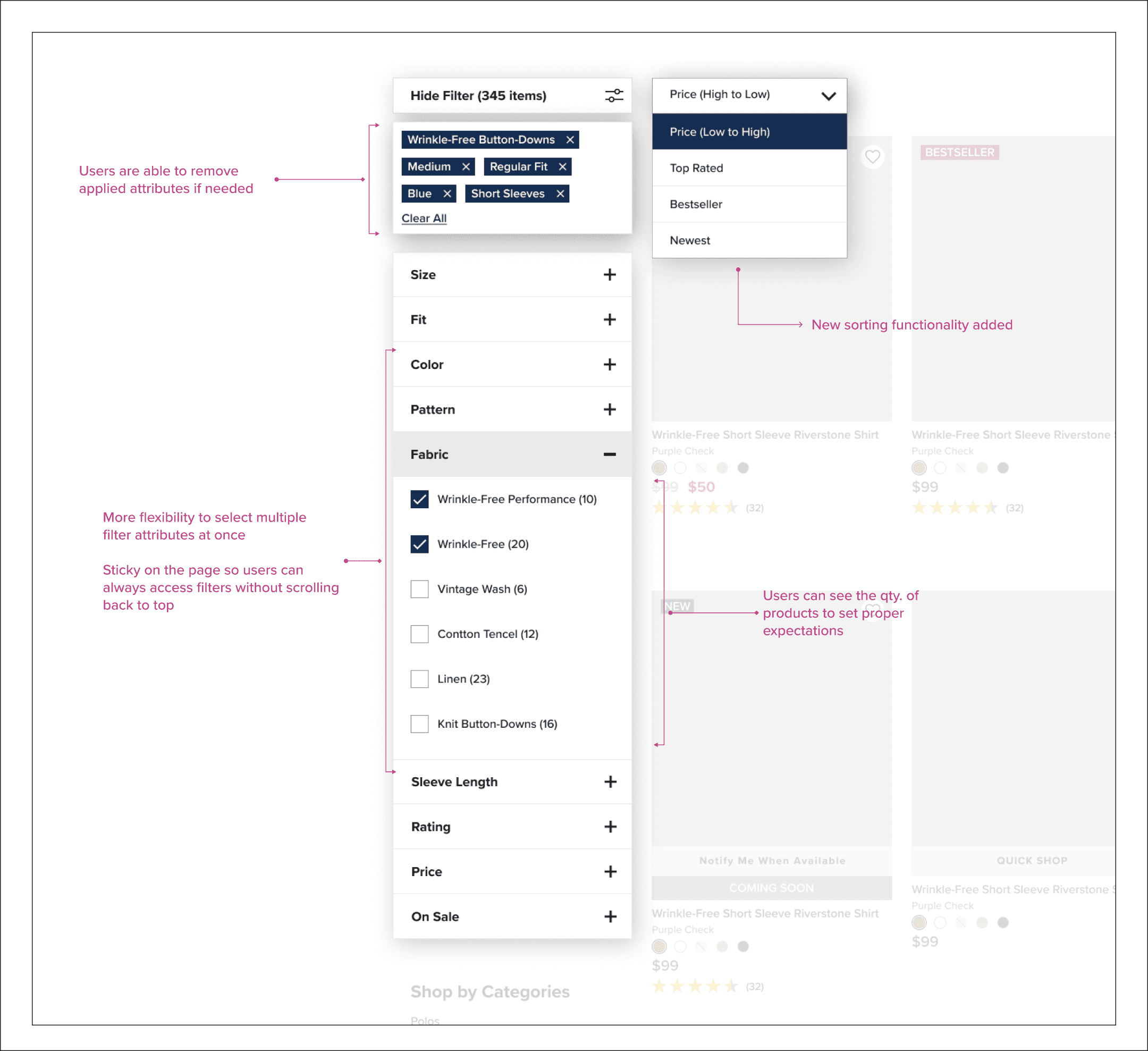
(2) Left Filter & Sort By Design
New Functionality
The old design had over-categorized links and limited users’ choices. We changed them to be filter attributes so users can select multiple filters to satisfy their specific needs.
(2) Left Filter & Sort By Design
New Functionality
The old design had over-categorized links and limited users’ choices. We changed them to be filter attributes so users can select multiple filters to satisfy their specific needs.
(2) Left Filter & Sort By Design
New Functionality
The old design had over-categorized links and limited users’ choices. We changed them to be filter attributes so users can select multiple filters to satisfy their specific needs.
(2) Left Filter & Sort By Design
New Functionality
The old design had over-categorized links and limited users’ choices. We changed them to be filter attributes so users can select multiple filters to satisfy their specific needs.
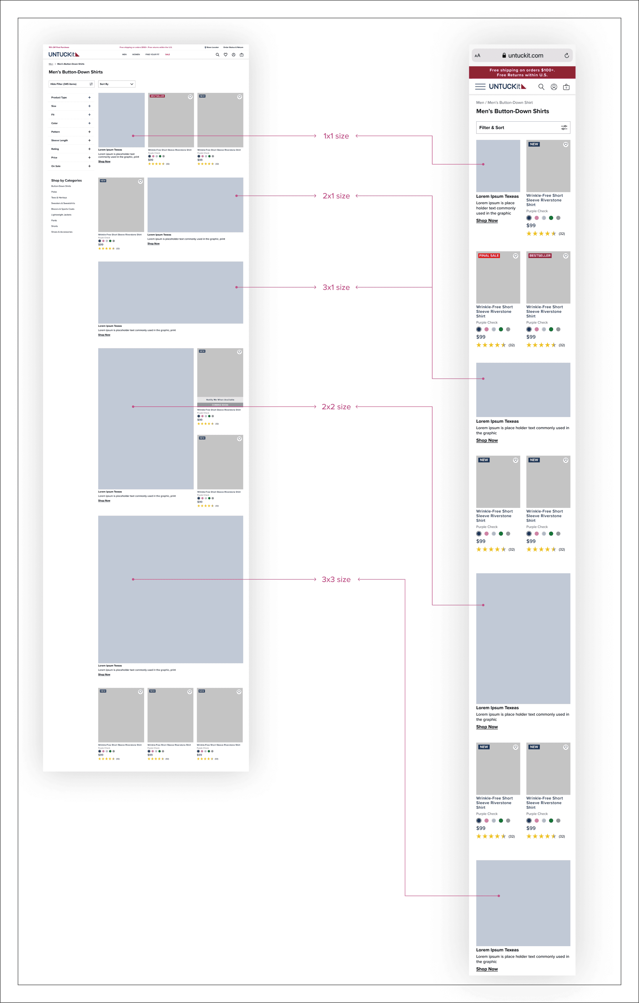
(4) Editorial Cards
New Functionality
We designed various sizes of editorial cards to enhance our ability to add richer content stories, elevating pages with static images, animations, and videos. By placing text below images, we can optimize for SEO tagging and meet accessibility requirements.
(4) Editorial Cards
New Functionality
We designed various sizes of editorial cards to enhance our ability to add richer content stories, elevating pages with static images, animations, and videos. By placing text below images, we can optimize for SEO tagging and meet accessibility requirements.
(4) Editorial Cards
New Functionality
We designed various sizes of editorial cards to enhance our ability to add richer content stories, elevating pages with static images, animations, and videos. By placing text below images, we can optimize for SEO tagging and meet accessibility requirements.
(4) Editorial Cards
New Functionality
We designed various sizes of editorial cards to enhance our ability to add richer content stories, elevating pages with static images, animations, and videos. By placing text below images, we can optimize for SEO tagging and meet accessibility requirements.
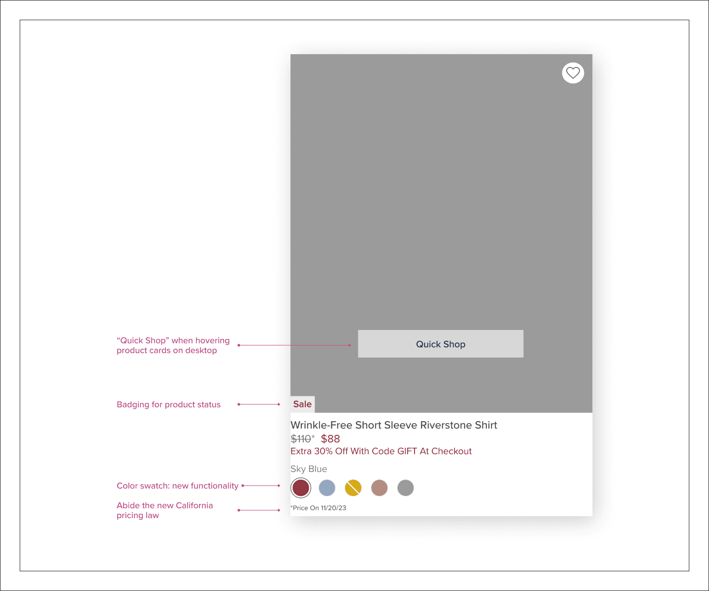
(5) Product Cards
New Functionality
To enhance the design, I restructured the product information below the images for improved readability, addressing the previous layout's scattered and distracting presentation. Additionally, I replaced text-only color descriptions with color swatches, allowing customers to better visualize and differentiate colors, thereby reducing confusion and enhancing their shopping experience.
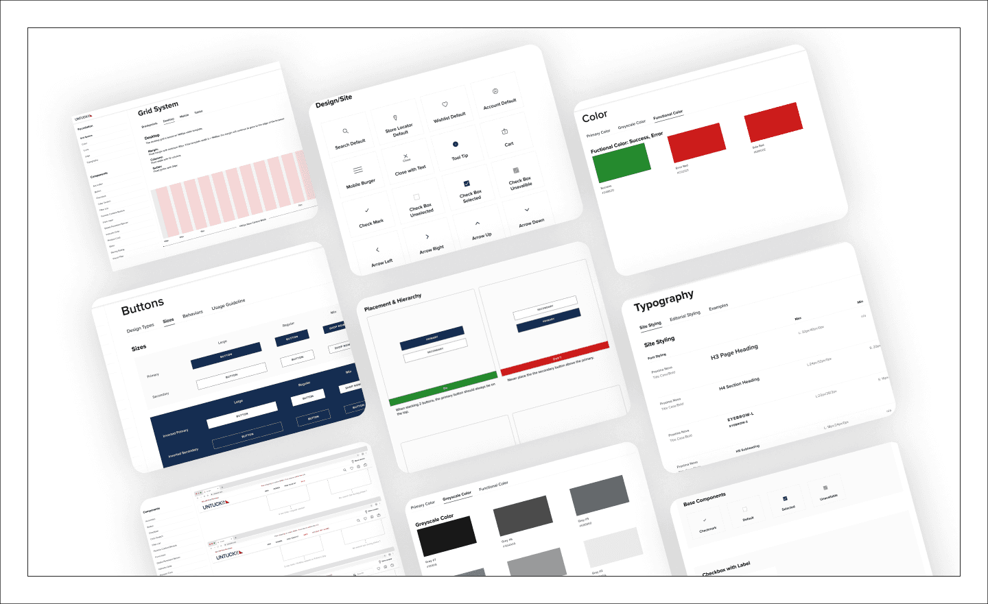
Style Guide
Building consistency and efficiency
Before my arrival, UNTUCKit's website was managed by print, graphic, and junior web designers. As the first senior leader specializing in UX & UI, I conducted a comprehensive design audit, uncovering major issues like inconsistency, varied fonts, accessibility problems, and poor SEO. Proactively, I crafted a design style guide during the Top Nav/PLP re-design, foreseeing its evolution into a cohesive design system, drawing from extensive research and past experiences.
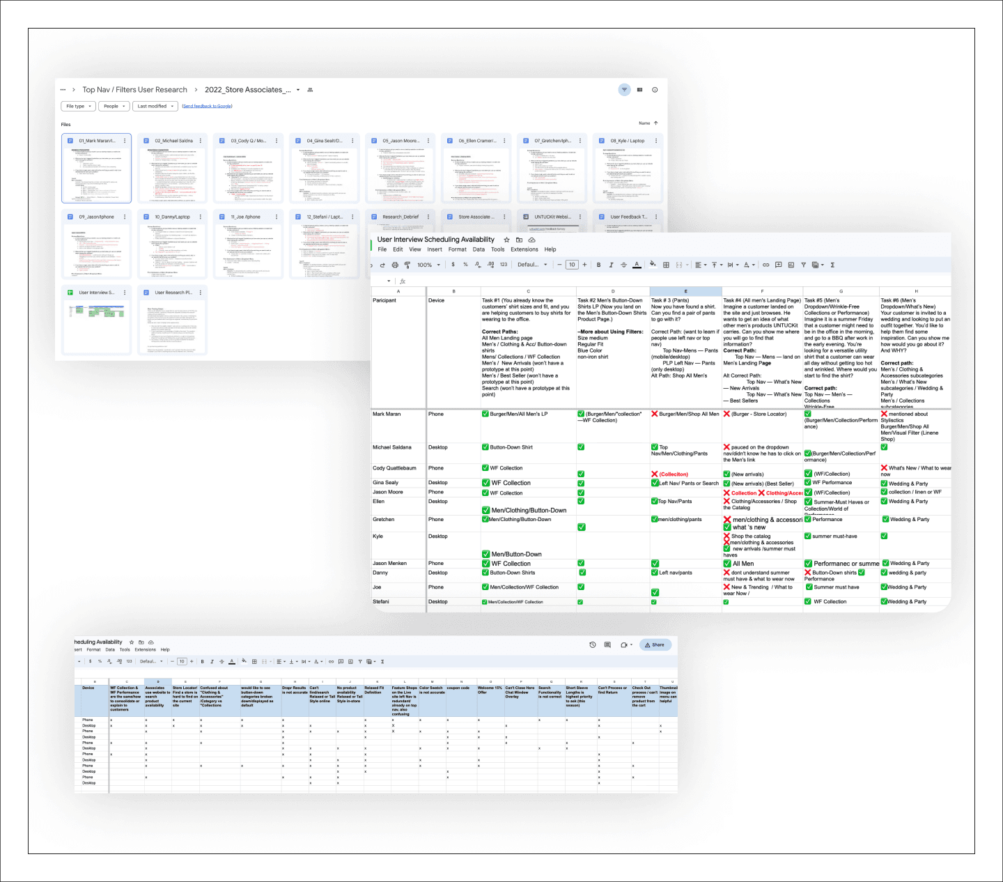
User Testing
User Testing
User Testing
User Testing
User Testing Feedback
Frontline Store Associates Bring Valuable Insights
I collaborated with data analysts to optimize user journeys, improve satisfaction, and inform design decisions. We reviewed metrics like click-through, conversion, sessions, and abandoned rate. This data benchmarked old versus new designs and convinced senior leaders to embrace changes, despite UNTUCKit's outdated UX practices.
“A lot cleaner and easier to maneuver.”
“I like how you guys added collaboration, so I think that's kind of an easy way to find the collabs.”
“Self-explanatory you can see the categories exactly what you're looking for.
“Very intuitive”
Reflection
Reflection
Reflection
Reflection
Post Launch
Iteration and Continuous Growth Drive Success
Post-holiday, we continue to monitor the performance, iiterate, refine strategies, products, and customer experience. Embracing iteration ensures long-term success in the dynamic marketplace, recognizing growth as a continuous journey. * In 2024, due to shifts in business strategy and marketing positioning, we revisited and enhanced the global navigation experience.